Average Grades
Free shipping on orders over 50€ up to 500g
French Online shop for beads and accessories for the creation of DIY jewellery and other creative hobbies
Log-in
0
Shopping cart
Shopping cart
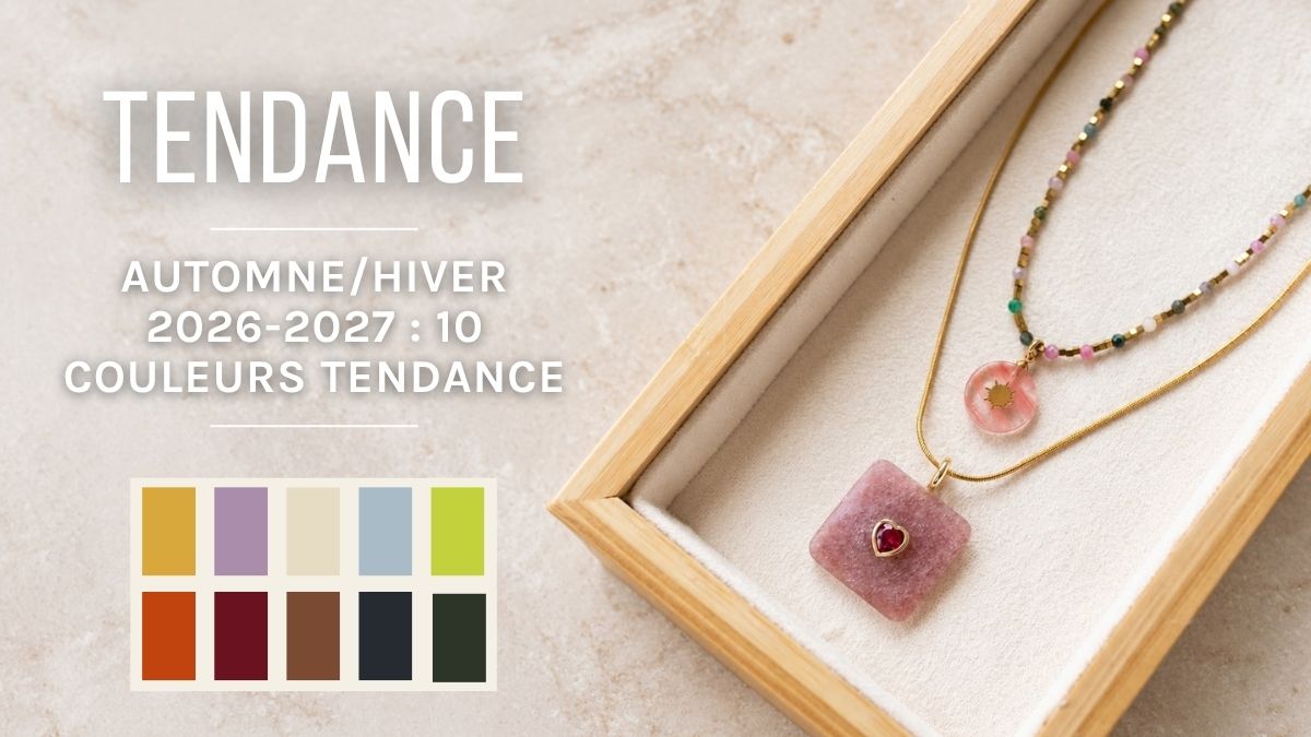
The Fall-Winter 2026/2027 color palette features deep, contrasting shades: icy blues, purples, burgundy, earthy greens, as well as a very bold chartreuse. Follow the rule of three colors (one primary, one secondary, and one neutral) for well-balanced, on-trend jewelry.
Each season brings its own color palette, and the Fall-Winter 2026/2027 palette is rich and varied. It features icy blues, deep purples, burgundies, and a very vibrant chartreuse. Good news for you: these trendy colors are perfect for creating jewelry.
Whether you’re new to DIY or have been creating for years, this guide will help you choose. For each color, you’ll find the key shades to know and material ideas to get started.
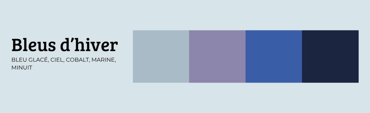
This family ranges from ice blue to midnight blue, including sky blue and cobalt.
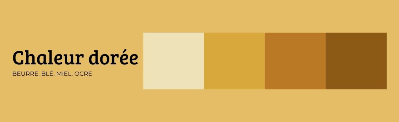
Butter, wheat, honey, sun, ochre: these soft yellows warm up gray days. They pair well with gold accents.
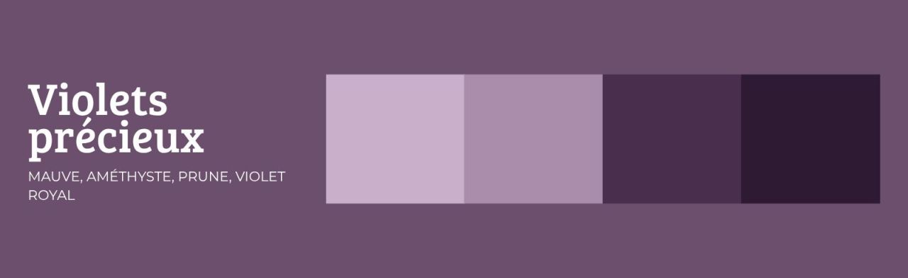
From mauve to plum, including amethyst and royal purple, this palette adds a touch of luxury to your creations. On the runways, the red-and-purple combination is all the rage this year!
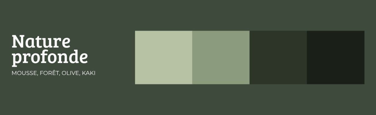
Moss, forest, cedar, olive, khaki: dark, earthy greens that evoke the fall woods.
Slate, steel, graphite, anthracite: this sophisticated gray makes all other colors stand out. It’s the perfect backdrop for a colorful design.

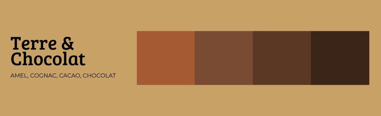
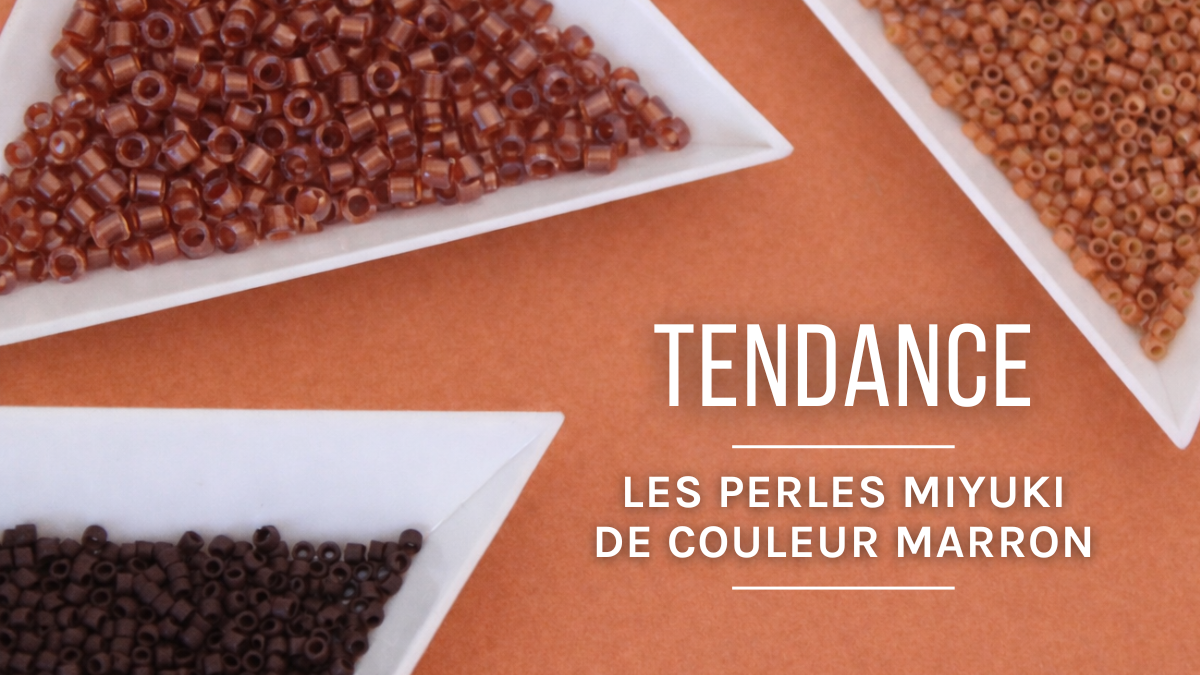
Camel, cognac, chestnut, cocoa, chocolate: these warm browns are always a safe bet.
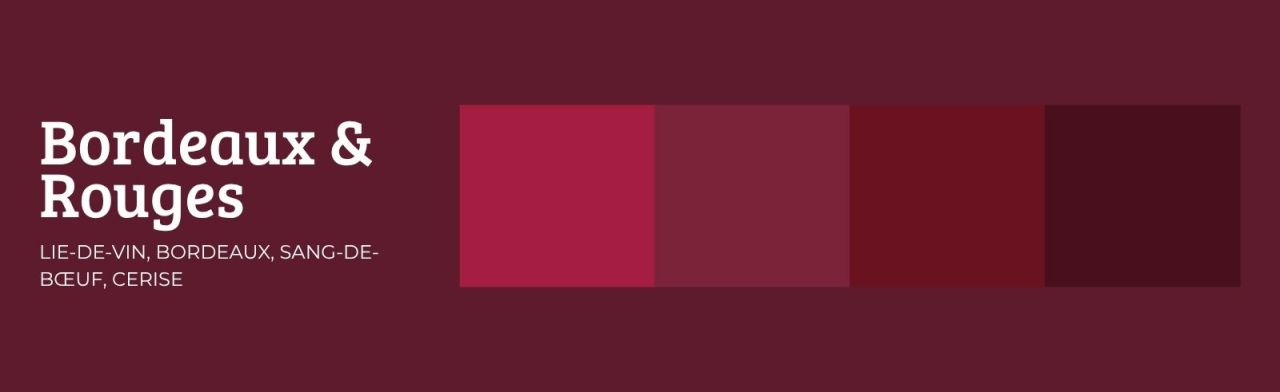
Wine-red, burgundy, oxblood, cherry: red makes an appearance in all its shades. This winter, burgundy is stepping up a notch!
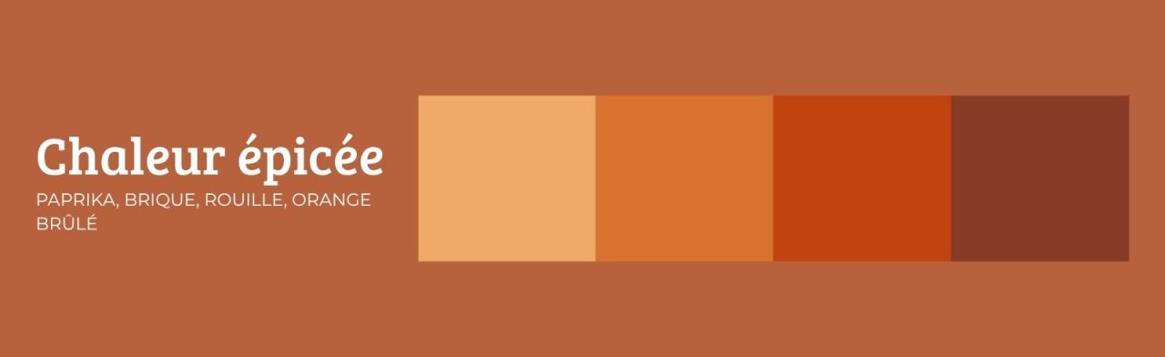
Paprika, brick, rust, burnt orange, peach: these warm tones liven up winter outfits without being over the top.
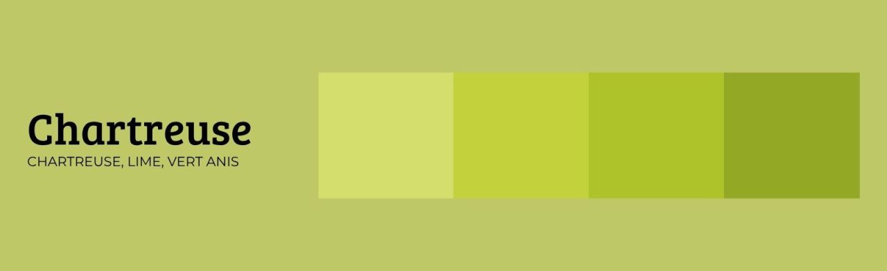
Chartreuse, lime, anise green: this is the boldest color in the palette. It works just as well in subtle accents as it does in large quantities.
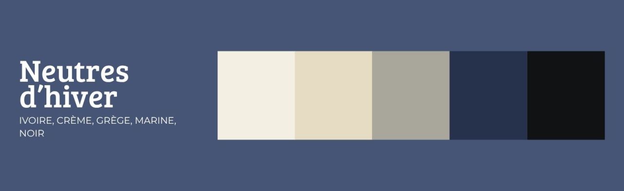
Ivory, cream, greige, navy, and black: these neutrals go with every other color. They serve as the foundation for your outfits.
Not all shades go together in the same way. Here are a few combinations that work well in jewelry.
A simple tip: choose one main color, one secondary color, and one neutral. This “rule of three” helps you avoid overly busy combinations.
The metal changes the feel of a piece of jewelry.
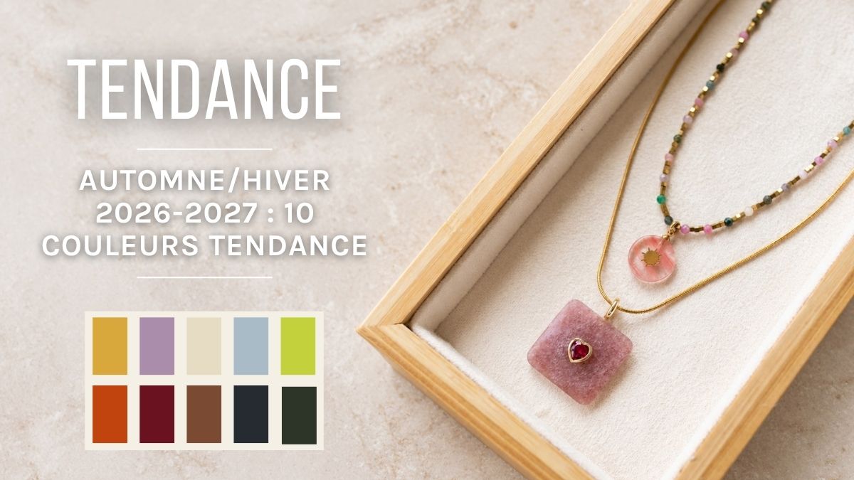
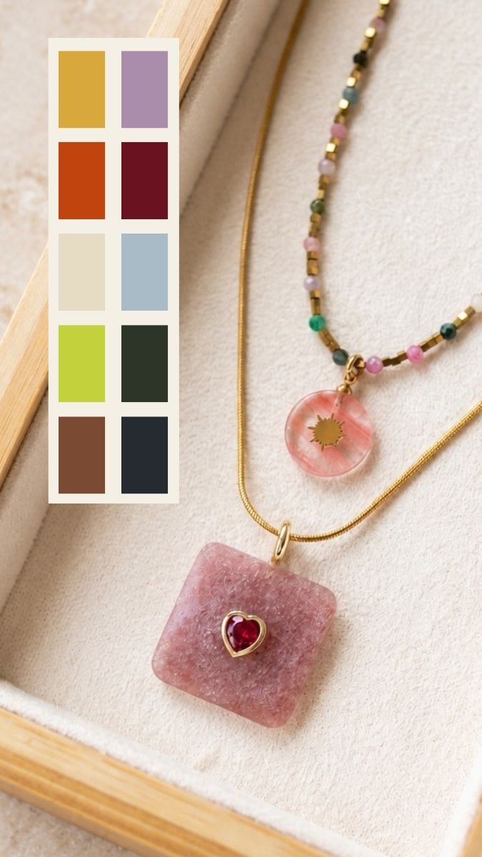

The main colors are winter blues, gold, purples, deep greens, slate gray, chocolate browns, burgundy, spicy oranges, chartreuse, and winter neutrals. This palette blends warm and cool tones.
Burgundy and purple are safe bets for this season. For a softer look, opt for an icy blue or a chocolate brown. For a bold touch, add a chartreuse bead.
Credits
Perles & Co, Internet & E-Commerce company [13/10/2026] Any reproduction, representation, adaptation, in any form whatsoever, even partial, is prohibited, except for reproduction for private use not intended for collective use, representation in the family circle (art. L 122-5 CPI) and online publishing on condition that the source is mentioned and a link is included to the corresponding page of our site www.perlesandco.com.

