What color combinations are trending in 2026?
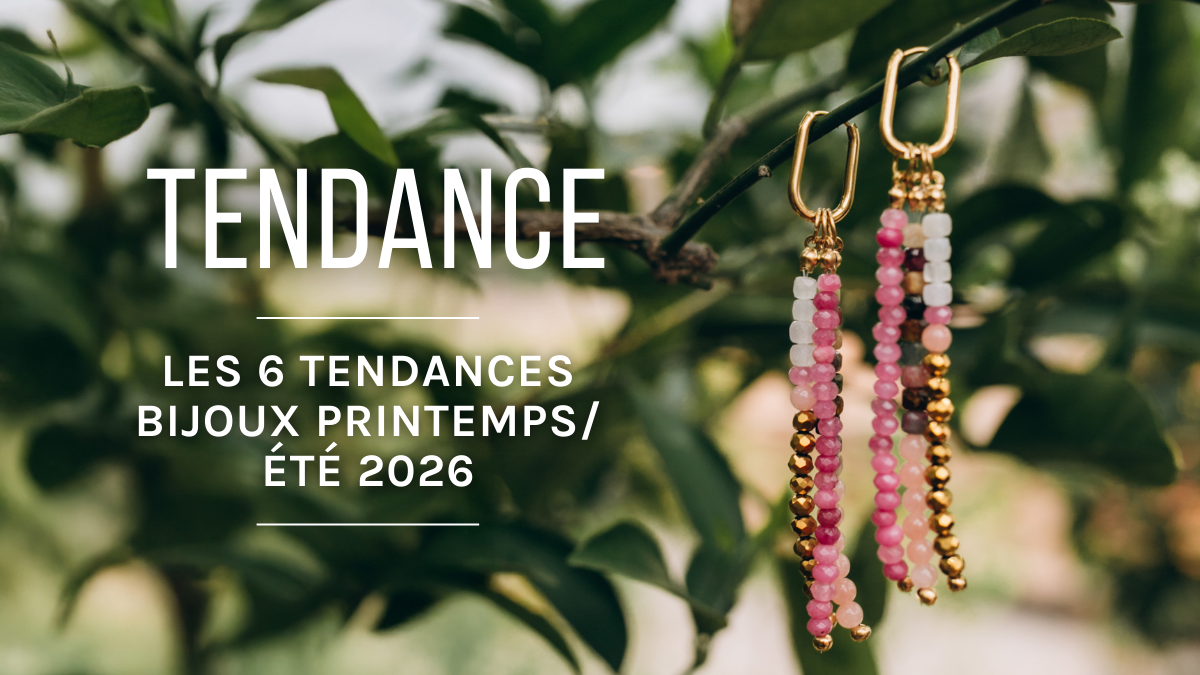
In 2026, color reigns supreme. Runways, trend agencies, and DIY creators all agree on one thing: color harmony is what sets ordinary jewelry apart from a piece that catches everyone’s eye. And with the vast Miyuki color palette—which includes hundreds of seed beads and Delica bead options—the possibilities are (almost) endless.
Whether you’re into loom weaving, peyote stitch, or brick stitch, choosing the right colors is sometimes the trickiest part of a project. Here are 10 Miyuki bead color combinations designed to align with current trends, from the softest to the boldest.
1. Pink and red: the duo you’ll see everywhere this summer
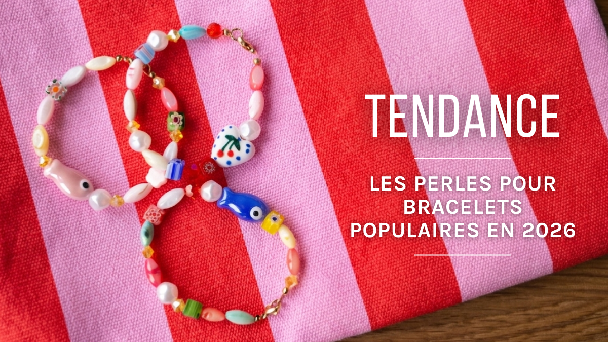
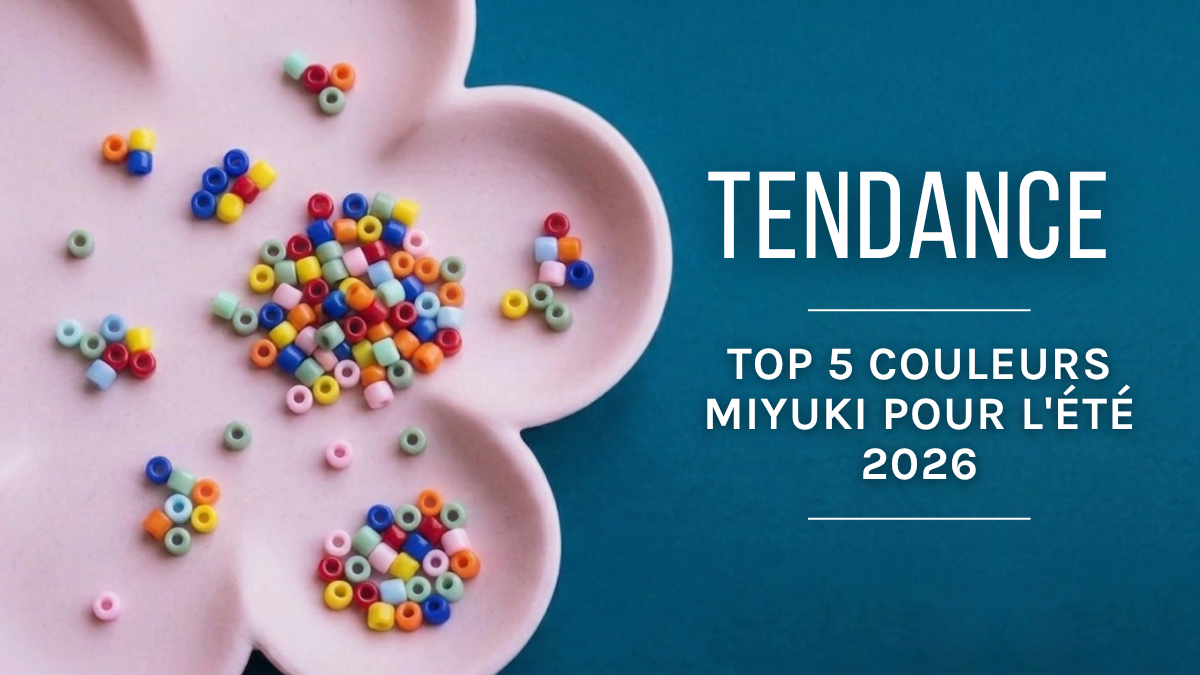
The combination of pink and red might have seemed risky just a few years ago. In 2026? It’s emerging as one of the season’s most popular color-block combinations. We’ve seen it take the fashion runways by storm, and it translates beautifully into Miyuki beads.
For a balanced look:
This color combination works particularly well for bracelets with geometric patterns and peyote-stitched rings.


2. Pastel yellow and light blue: pure freshness
This color palette is directly inspired by the spring-summer 2026 shades (lilac, pastel yellow, and soft blue). It adds a light, summery feel to any weaving project.
It’s the perfect combination for a summer bracelet, a bag charm, or lightweight tubular peyote earrings.


3. Green and white/ivory: natural elegance
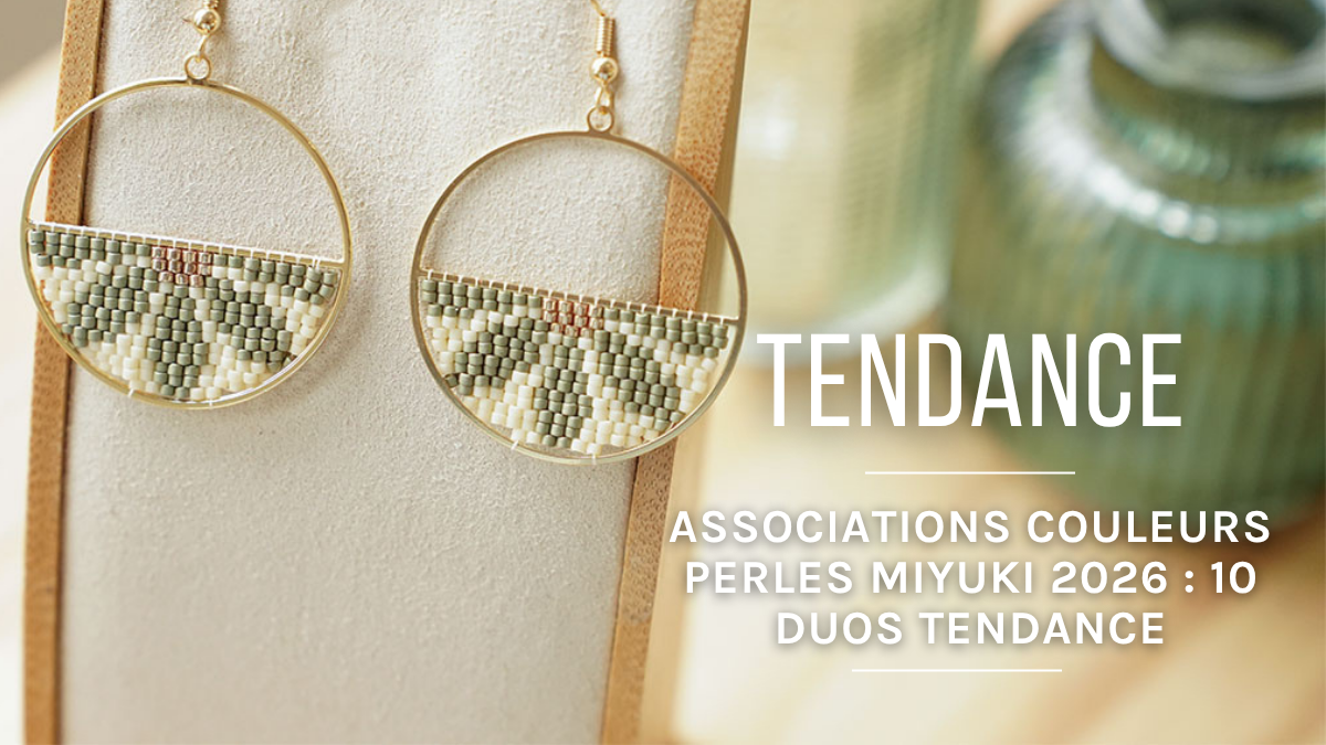
Green—whether mint, sage, or eucalyptus—is one of the standout shades of 2026. Paired with white or ivory, it evokes botanical jewelry and the chic cottagecore style that’s all the rage right now.
Some combination ideas:
- Mint green + pearlescent ivory: soft and romantic
- Light green + opaque white: a natural, almost mineral look
- Eucalyptus + silvery cream: understated elegance, perfect for everyday wear
Our Eucalyptus Mix kit explores exactly this world of fresh greens and soothing shades—ideal for getting started without getting lost in the color chart.


4. Dark green and blue: the richness of depth
Emerald green + blue: this combination marks a striking comeback in summer jewelry for 2026. It’s a palette that’s both luxurious and mysterious.


5. Pink and yellow: the “dopamine dressing” trend in bead form
The “dopamine dressing” trend—wearing bright colors to boost your mood—is still going strong this year, and you can incorporate it into your jewelry! Pink + sunny yellow is the ultimate eye-catching combination.
It works best as:
- Alternating stripes on a loom-woven bracelet
- A checkerboard pattern on an even peyote weave
- Accents of yellow on a pink background for a softer look
Try it with opaque finishes for maximum visual impact.


6. Blue, orange, and purple: the maximalist trio
Here, we’re not offering a duo, but a trio: blue-orange-purple. Because in 2026, we’re daring to try bold combinations… and on jewelry, it works perfectly!
How to balance it:
- Blue as the dominant color (2/3 of the weave)
- Orange as a pattern or accent line (complementary colors = strong contrast)
- Purple as a finishing touch to soften the overall look
This palette calls for a bit of boldness, but the result always turns heads.


7. Teal and Powder Pink: The Soft Palette
Teal, that blue-green shade with aquatic undertones, is one of the trending colors of 2026. Paired with powder pink, it creates a palette that’s both modern and timeless.
A highly versatile combination, equally beautiful on a delicate bracelet as on a wide cuff. It perfectly aligns with the combinations highlighted by current trends: teal harmonizes naturally with powder pink for an elegant balance.


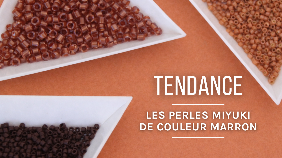
8. Terracotta and Ivory: Bohemian Warmth
Terracotta has been a staple in trends for several seasons now, and 2026 is no exception. Paired with ivory or cream, it creates a warm, organic palette with bohemian accents.
This palette is perfect for ethnic-chic jewelry: wide loom-woven bracelets, necklaces, or fringed earrings. A natural, artisanal style that’s very popular right now.


9. Lilac and Mustard Yellow: A Soft-Intense Contrast
Here’s a combination that’s less obvious but incredibly effective. Soft, fresh lilac pairs beautifully with mustard yellow, which adds warmth and depth.
How to style these two shades:
- Uselilac as the dominant color for a soft, modern look
- Usemustard yellow in regular accents (stripes, herringbone, repeating patterns)
- Off-white or bead gray to separate the two shades if needed
This trio works just as well for beginners (simple striped patterns on a loom) as it does for experienced weavers (complex geometric patterns in peyote stitch).


10. Coral, apricot, and white: the sunset trio
Directly inspired by the expressive colors highlighted for 2026, this trio evokes a Mediterranean sunset. Coral + apricot + white—it’s a luminous, summery, and deeply on-trend palette.
- Vibrantcoral as the main color
- Apricot in a gradient or as an adjacent pattern
- Opaquewhite or pearlescent white to add structure and lightness
This trio is ideal for spring-summer designs: stackable bracelets, beaded necklaces, or light, dangling earrings.


How to choose your Miyuki color combination?
It’s not always easy to decide when faced with hundreds of options! Here are a few helpful tips:
- Complementary colors (blue/orange, purple/yellow, red/green) create a strong, dynamic contrast, perfect for geometric patterns.
- Analogous colors (green + teal + blue, or pink + coral + apricot) produce a harmonious and fluid look, ideal for color gradients.
- A neutral color (white, ivory, beige, black, gold) acts as a balancing element in any palette.
- Finishes influence how colors are perceived: a matte bead appears softer, while an AB bead shimmers and deviates from its base color.
If you’re starting from scratch, our Miyuki By Perles & Co kits are a great place to start: the colors have already been selected and coordinated for you, with a jewelry design included.